
72 / Why Chinese Apps Look So Busy (and other goodies)
And Why It Works

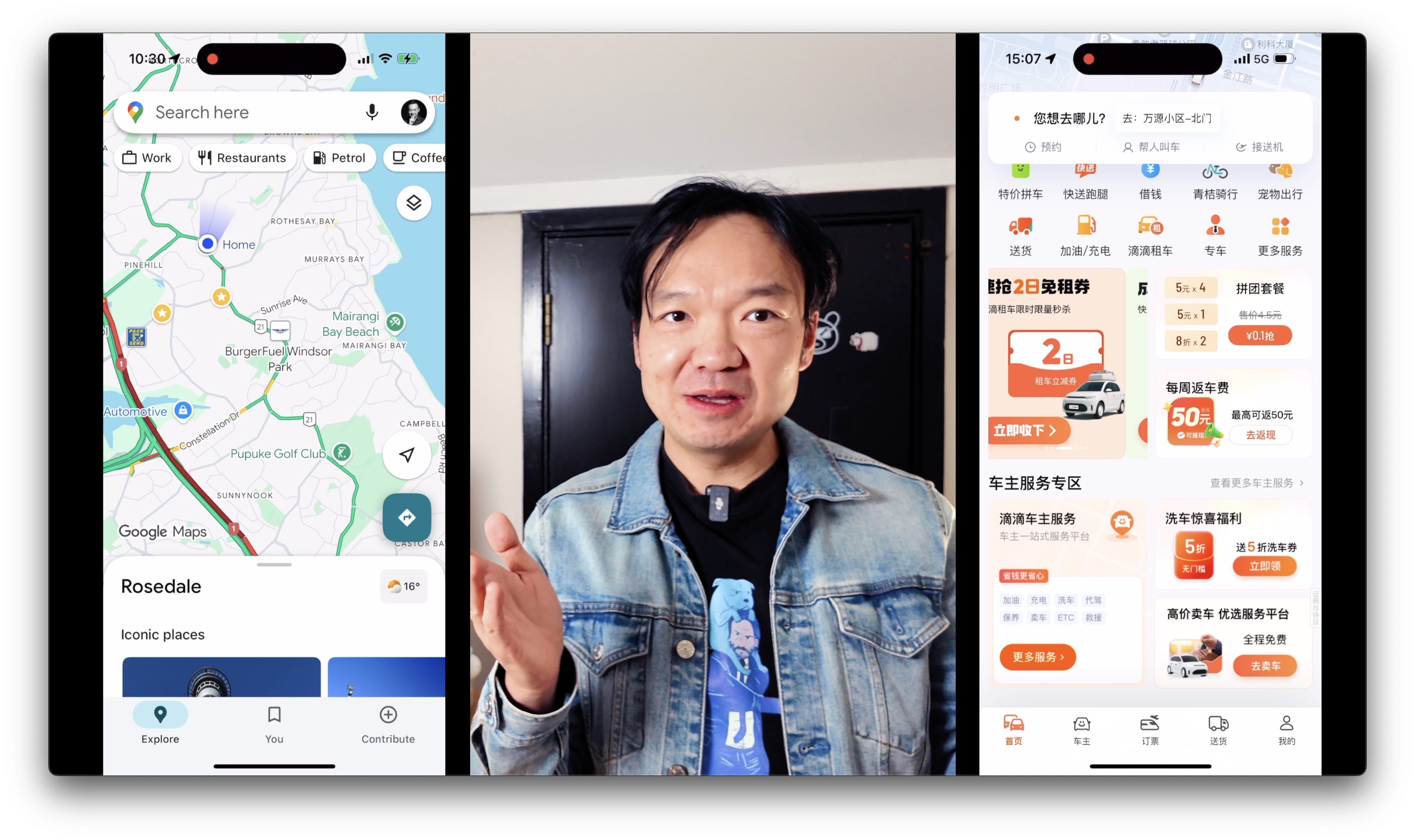
Have you ever opened a Chinese super app and felt a bit overwhelmed? Apps like Google Maps are known for their clean, minimalist design, while a Chinese super app like Tencent Map is filled with icons, coupons, and mini-games, all on one screen. Both apps are designed to help you get somewhere, but their approach to design is completely different. What if the busy, "chaotic" design of these apps isn't a flaw, but a brilliant strategy?
The "Everything at Once" Approach
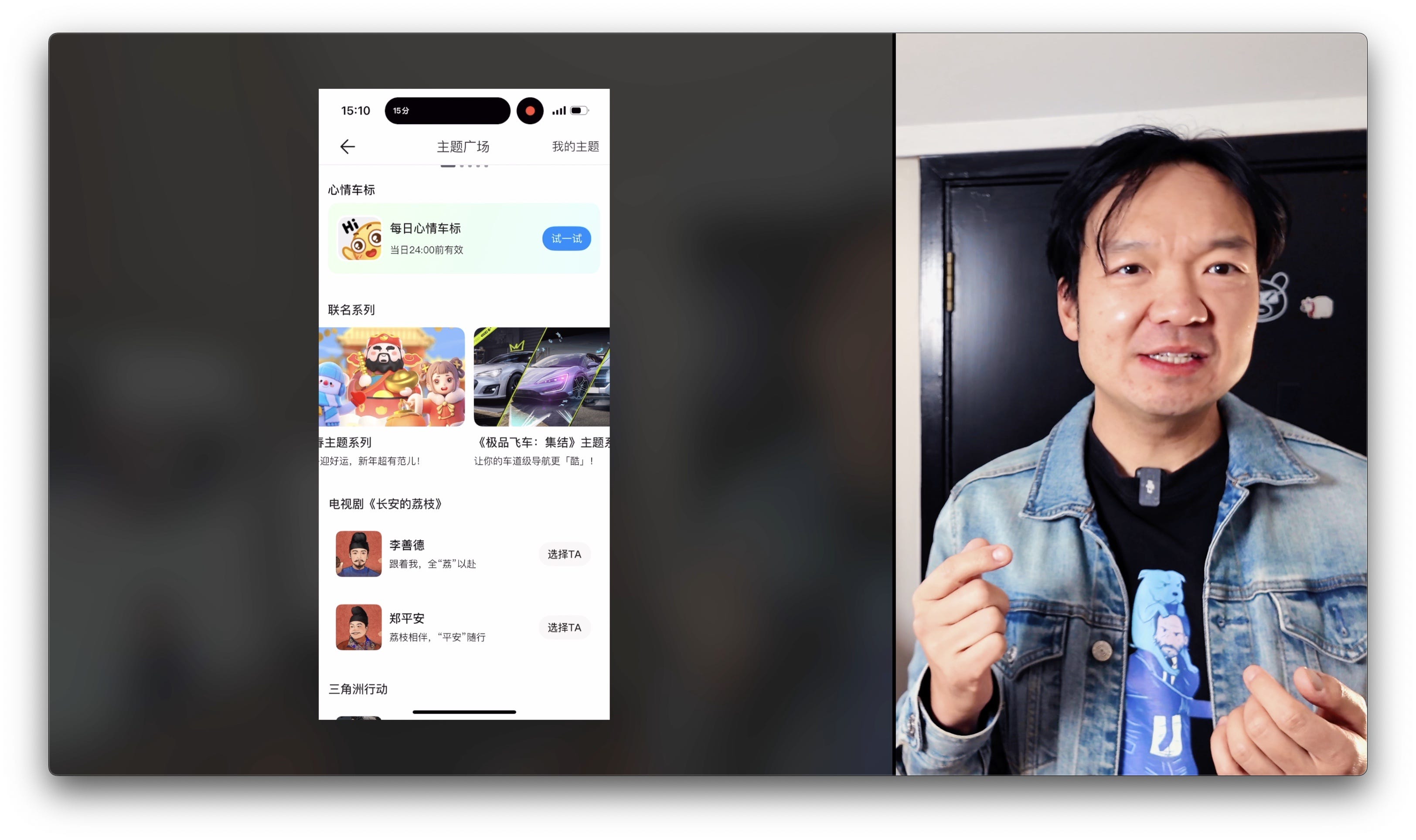
When you open a Chinese super app, you're not just accessing a single service; you're entering a full ecosystem. This design philosophy is known as progressive aggregation, which involves bringing many different services together onto a single screen and trusting the user to filter what they need. For example, the home screen for the Didi app isn't just for booking a taxi; it also offers grocery delivery, intercity buses, freight services, and even a finance tab where you can get a microloan or buy insurance. This is a stark contrast to Western apps like Uber or Google Maps, which use a sparse interface and guide you through a simple, three-step process. While this "all-in-one" approach may seem chaotic to Western users, it's considered efficient and familiar to local users.
The Reasons Behind the Design
So, why do these super apps look the way they do? There are three main reasons:
Super app economics: In China, the cost of getting users to download an app is very high. Once a company secures that valuable space on a user's phone, they try to maximize the lifetime value of that user by cramming in as many services as possible. As one entrepreneur said, the goal is to be the one app that a user can't delete.
Infrastructure and policy: China's unified QR payment system and real-name ID policies make it simple for companies to add new services on top of existing user data. For instance, an app like Didi already knows a user's commute habits and spending, which makes it easy to offer services like microloans or insurance within the same app.
Culture: In many high-context cultures across China and Southeast Asia, an information-rich layout is seen as useful, not cluttered. This contrasts sharply with the Western ideal of minimalism. The more options available, the more it can feel like abundance and care, similar to how having twenty dishes on a table at a Chinese banquet or a Korean buffet is a sign of hospitality.
A New Perspective on Design Principles
The primary lesson here is that minimalism is a market preference, not a universal virtue. Before you decide a product's design is "too busy," consider your audience's culture, context, and their tolerance for density on a screen. In situations where customer acquisition costs are high and cross-service data can shorten a user's journey, a packed user interface may actually be more effective than a minimalist one, as long as the primary task remains clear.
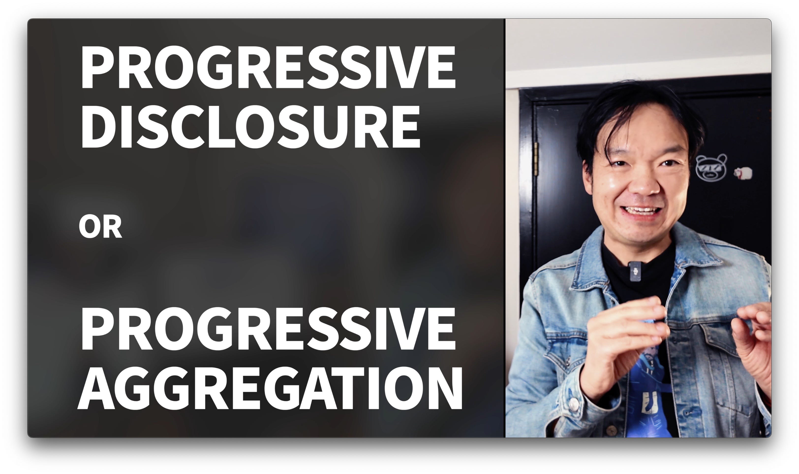
This highlights a key difference between Western and Chinese design principles. Western design often uses progressive disclosure, where features are hidden until a user requests them. In contrast, Chinese super apps use progressive aggregation, putting all features upfront and trusting users to find what they need. Neither approach is better than the other; they are simply different adaptive strategies. The goal is to design for people, not for dogma.
So, the next time you see a super app with what seems like a chaotic design, remember that it's a reflection of unique economics, infrastructure, and a culture that creates abundance with care.
Watch video here:
Weekly Goodies
10 Principles for Designers in the Age of AI
Ryo Lu’s post on X reads like a “new age designer manifesto” for the AI era. Each point is short but loaded with intent:
Don’t build slot machines
Don’t fake humans
Don’t hide the messy truths
Don’t create black boxes
Don’t make people feel stupid
Don’t extract value or attention one-way
Don’t optimize for vanity metrics
Don’t gatekeep knowledge
Don’t make tools that divide
Don’t sacrifice agency for convenience
My personal take:
When I saw this post, one thought flashed in my mind: “This is exactly the manifesto of a designer in the AI age.”
Every “don’t” resonated deeply with me. As product designers, it’s easy to get seduced by features designed to boost engagement or vanity metrics, but this post reminds us to put human value first.
“Don’t build slot machines” — a blunt reminder to avoid creating “dark patterns” that exploit human weaknesses and cause addiction.
“Don’t hide the messy truths” and “Don’t create black boxes” — in the AI era, this is about transparency. Users deserve to know how a product works and why it makes certain decisions.
“Don’t make people feel stupid” — a good product should empower users, not leave them feeling helpless. It should respect their intelligence and agency.
Original link (post): https://x.com/ryolu_/status/1953112152199581742
The Future of AI in the Creative Industry
In this episode of The Futur, the conversation compares AI’s role in the creative field to the 1990s design “rule-breaking” era — when young designers reinvented how images were made. Today, AI is rewriting the rules again, speeding up creation, compressing timelines, simplifying workflows, and handling tedious tasks so creatives can focus on the ideas that matter.
Kevin Lau stress that thriving in the AI era means keeping both passion and detachment, embracing new tools, creating tangible and marketable ideas, collaborating effectively, and pushing for constant growth and innovation. AI can accelerate creativity, but its impact on jobs and the human experience is still uncertain.
I relate strongly to this perspective — AI is a booster, not a replacement for the core of creativity. Just as better tools don’t automatically make better art, the real value is in using the time and energy AI frees up to think deeper and craft better. In my own creative work, AI has stripped away repetitive chores, but the story and vision still need my own hands.
Original link (video):
A Landing Page Design with Premium Feel
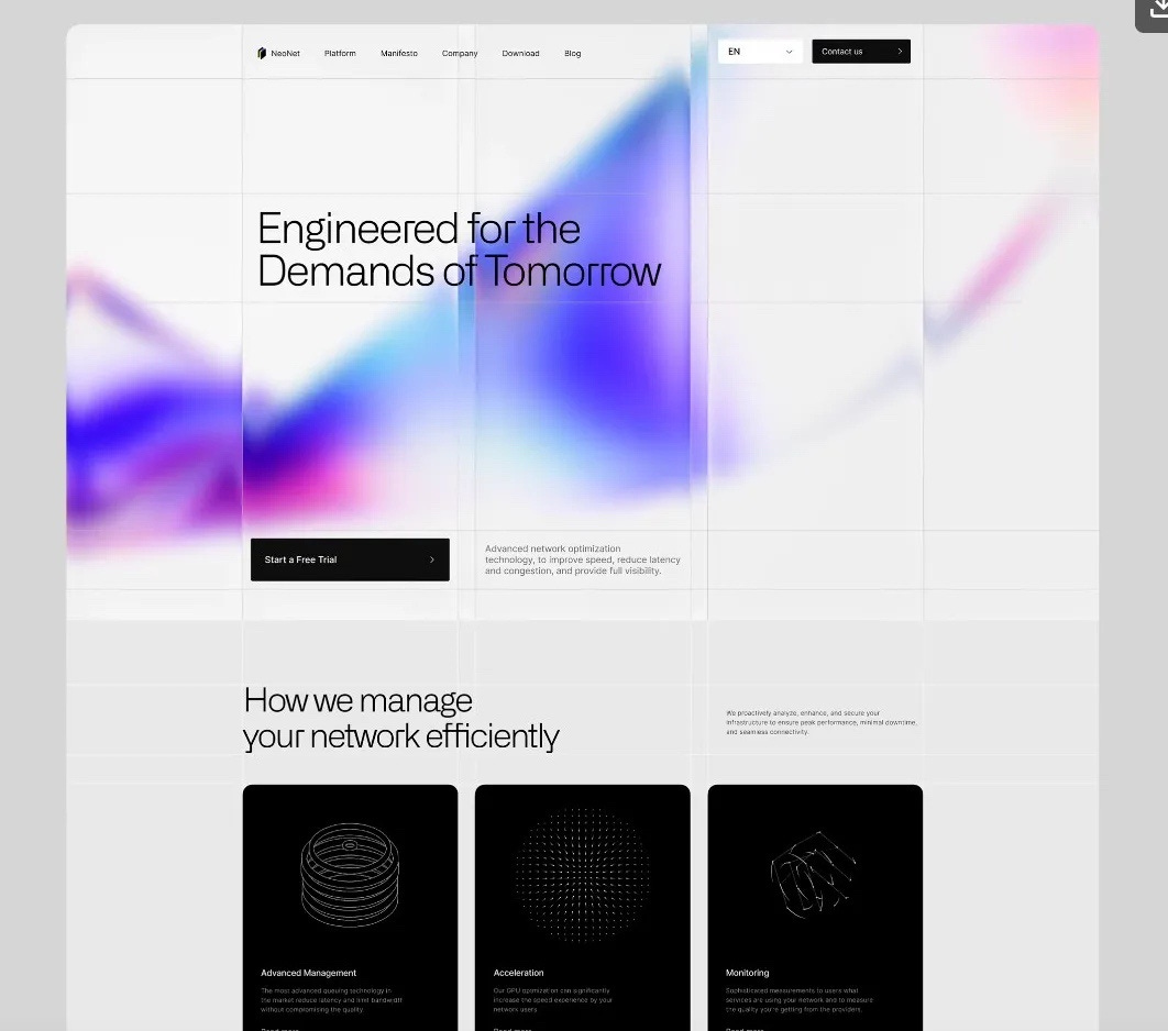
Basit A. Khan shared the first look at his new landing page design on X. Designers call it “clean,” clients call it “premium,” and he simply calls it “done.”
The highlight here is in the hero section — an abstract animated background combined with blur and glass transparency effects, giving it an instant sense of elegance and futurism. It’s deceptively simple, though the glass effect likely requires code to implement so it maintains both visual quality and performance.
My personal take:
I love this “less is more” approach to achieving a premium look. For tech brands especially, the clean + futuristic visual language works beautifully. Often, it’s not about piling on elements, but about using a few precise visual techniques to convey the brand’s essence. If you’re working on a website and want to communicate innovation and forward-thinking, this style is absolutely worth exploring.
Original link (post): https://x.com/basit_designs/status/1953476697497452933

Hello, I’m Bear—a product designer, UX mentor and an award‑winning bilingual podcast host, currently living in Auckland, New Zealand. I enjoy sharing insights from my work, life, and study, helping all of us grow together.
Bear Academy Newsletter is my weekly email packed with thoughts on technology, design, and productivity—featuring book breakdowns, learning tips, and career reflections. Subscribe for free at bear.academy
💬 Contact
Youtube.com/@Bearliu - A video is worth a thousand words
bear@beartalking.com - The old fashion email way
LinkedIn.com/in/bearliu - My professional life
Beartalking.com - all my posts, in English and Chinese
https://twitter.com/bearbig - Majorly I post in Chinese